Gold Leaf and Granite
Divergent Design for the Creative Community

IS IT ART?
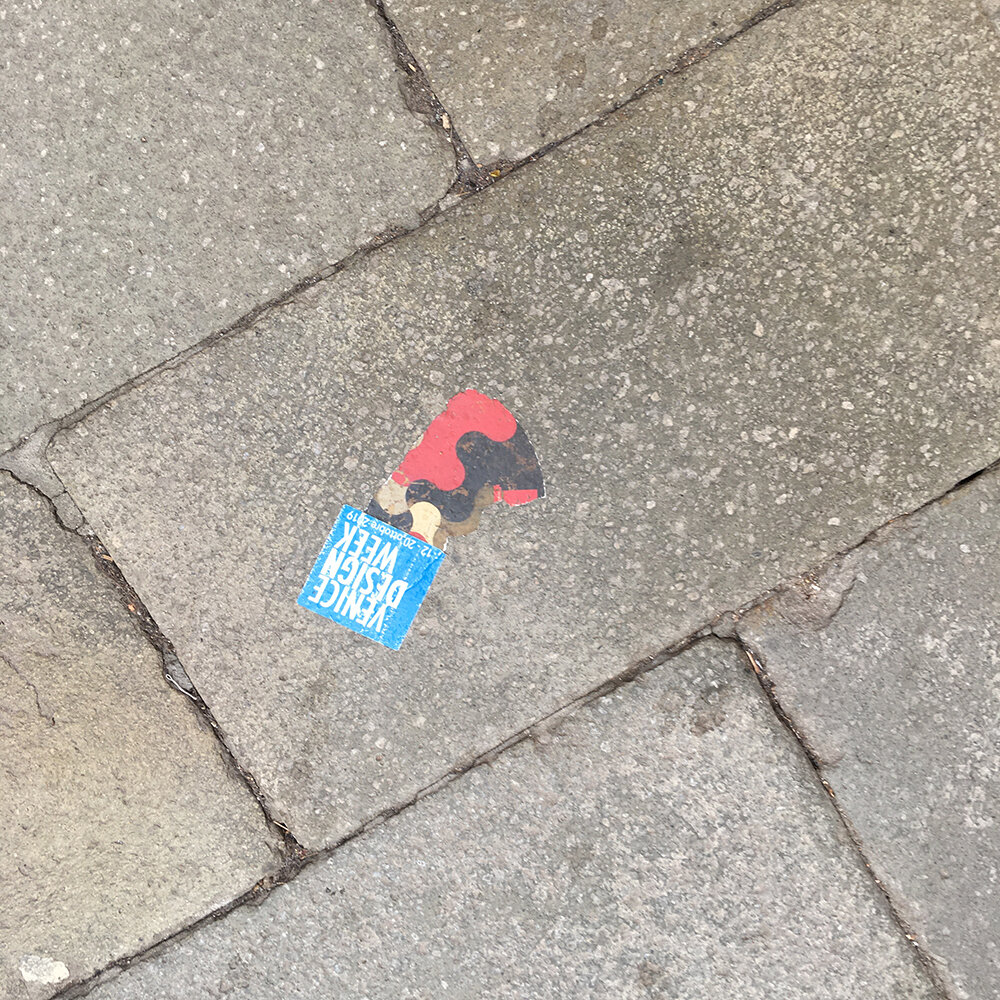
Uh, yes . . . Arsenale, Venice, 2019

No Title
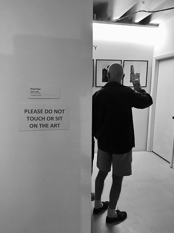
Standing on a Bruce Nauman


BEFORE THE PLAGUE
GREETINGS FROM MIAMI

Bob and Benito, together again . . .

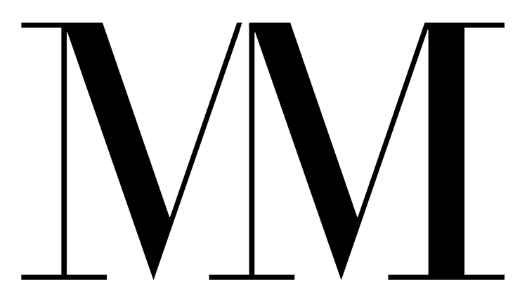
TYPE GEEKS

Well, it’s the future . . . Even, or especially, for young people who will have to live and thrive in it longer than the rest of us. Considering we went to the moon on less RAM than an iPhone, this should be Utopia. It may be the future but its not the future that they dreamed of at the Bauhaus. It’s a weird new world where we urinate on logos and the corporations who have colonized the deodorizer holders see that as a branding opportunity. Where you can live your life on your phone, never see anyone, and still have a thousand friends. Where the best minds are on Wall Street, not NASA, and people pay a premium to wear advertising on their clothing. Computers are faster than we are and look like Lamborghinis, but the type still sucks.
I’m old enough to be a product of Modernism, and glad I won’t be around to see where Post-Post-Modernism ultimately takes us. It may turn out OK, if the lights stay on. Maybe I’m just sentimental because I still read actual books and can remember Gravure printing. There will still be actual books when the grid goes down, even if we’re reading them by candlelight.
The digitization of design has brought us many good things. (I certainly never want to spec type again.) It has also brought us one-syllable widows at the top of a column on the front page of the New York Times. Does it matter? It used to, but the old typesetters are dead or downsized and no one really gives a damn anymore. No one has time for useless minutiae, let alone kerning or hyphenation. Time magazine looks like a facebook page, and that’s probably the point. As the visual field gets smaller and so do attention spans, the details don’t matter. We’re up to our nipples in visual effluvia and it just keeps metastasizing. Emojis will eventually replace typography as we knew it and no one will notice except type geeks and Luddites who remember ligatures. And really: Does it matter if the sky is on fire?
Just in case we don’t blow it, here is a modest argument for deep design memory, for looking, thinking, and integrating 500 years of trial, error and human invention into digital media in a way that isn’t easy or predictable. This might be the utopian future that all those dead Modernists ranted about, but it isn't pretty.

We should have David Carson, and Jan Tschiold, and type
that looks as good as the explosions and exit wounds in
video games. Strip mining design annuals for cool ideas
and sampling the gods of Modernism is legitimate in the Post-Everything petri dish where everyone is appropriating everyone else and reprocessing the same raw material into ever-mutating mashups, knockoffs, and the occasional relatively compelling concept. Even Picasso said you have to know who to steal from,
but you also might want to know what it is you're copping,
why it was awesome in 1940, and why it’s still cool eighty
years later. And then, as Yogi Berra said to his wife when she asked him which church he wanted his funeral at: “Surprise me!”